
3 Concepts of Responsive Web Design
Let's code from scratch and understand the basics of media queries.

Musician, photographer, videographer, artist, plant enthusiast, reader, gamer | A Queer Nerd 🏳️🌈 | Welcome to My Coding Journey! 🤓👩🏻💻 #100Devs
I'm super new to coding, so feedback and comments are MOST welcomed!
What's the point of responsiveness?

We do all of our online activity on various devices, and it's important to have your site stay user-friendly for different screen sizes. Responsiveness is key for having your clients/users stay engaged with your website and content no matter the device they use. It will also help your site rank well on Google since it’s part of their algorithm. You'd want your site to respond well and get found on Google, right?!
So, let's code from scratch and learn how you can make your website responsive with 3 basic concepts of media queries!
Fluidity
Avoid fixed widths and use percentages.
A fluid website avoids having fixed columns and widths, and instead uses relative widths and percentages. For example, the box below has a width: 100% its width will stay at 100% no matter the screen width.

This also can apply to images! If you want your image to maintain its size, you can also set its width to a specific percentage. For example, if an image has a width: 30% and it'll stay at 30% relative to the screen size.
Elasticity
Text should use a responsive unit of measure.
When it comes to text, it's important to keep in mind that the browser's default font-size may change. You need to have your website's text resize suitably. Don't waste time trying to calculate font-sizing...This is where the units em's and rems's come into play!
EM's vs. REM's
The unit em is a responsive unit where it sets the font-size of an element relative to the parent's font-size. Confused about parent-child relationships? Check out my other blog here.
Let's take a look at this example:
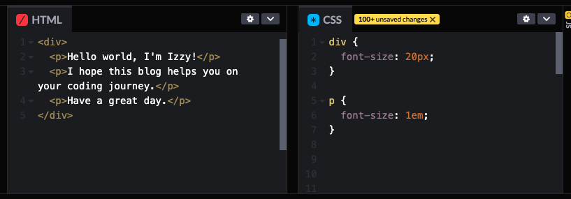
The p children all have a font-size: 20px because their parent element, div, is set to 20px. So, that would mean 1em = 20px. If you want to double the font-size of the p children, you can set div's size to 40px, thus changing the value of 1em= 40px.
The em unit is very useful and can save you time from needing to change every element's font-size.
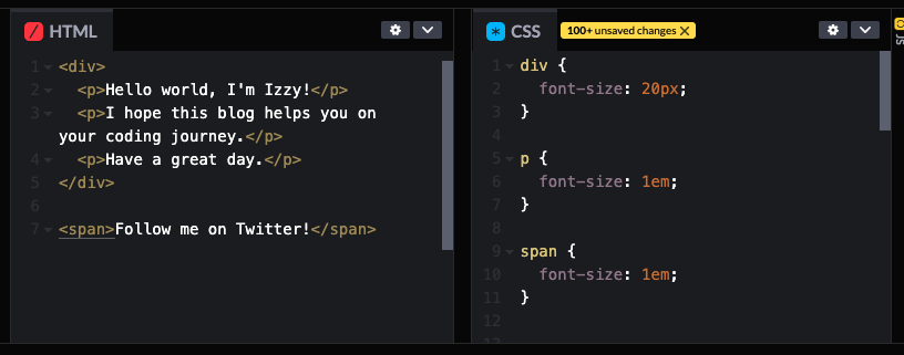
The downside about using the em unit is that it can only reach the closest parent element. If you look at the example below, I added a span and it has no parent element, so the unit 1em = 20px does NOT apply and instead uses the default browser size.
Now, let's take a look at rem's.
The unit rem stands for root element and looks to the source, the HTML element, and ignores the parent element.
Look at this example:
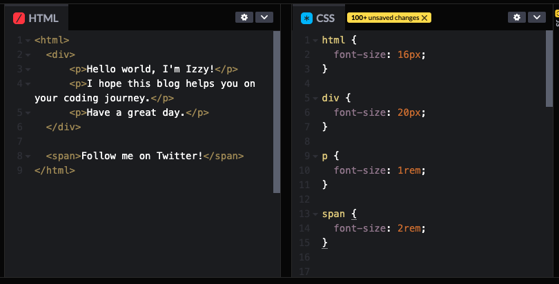
I changed the p's font-size to 1rem and that would mean that they would ignore their parent's value of 20px and instead listen to the root element, 16px. I also changed the span element to 2rem = 32px.
rem's are useful for accessibility issues. For example, if the user needs enlarge the text and changes the browser's default font-size (which is 16px), then all the rems will respond accordingly.
This is what is so useful about responsive units. You can make one change and everything responds!
Content Decisions
What content do you want to show?
To have a responsive site, you need to decide what content and how the content should be displayed on various devices. For example, would you want your sidebar or navigation bar to show up on mobile? This is where media queries do their magic! Media queries can be used as "breakpoints" for different screen sizes.
Let's break it down with this example:
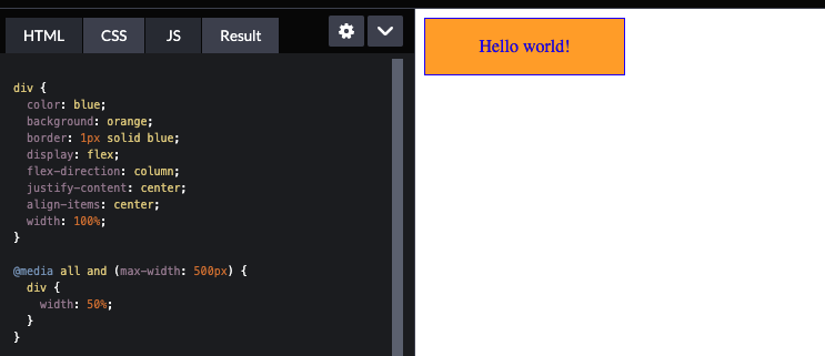
The media query @media all and (max-width: 500px) { div { width: 50%; } }} has a "breakpoint" at 500px. This query is essentially saying this:
"When my screen's maximum width is at 500px, the width of the orange box will change from 100% to 50%."
There are so many ways you can set elements at various breakpoints. You can “hide” content by using display: hidden. You can also “stack” content instead of having them display side-by-side using display: flex and set its direction to flex-direction: column. Try it out and see what happens!
Concluding Thoughts
It’s a lot of trial and error!
Keep these basic concepts in mind and you’ll have a great responsive site! Hope you enjoyed this brief introduction to the basics of media queries!
Thanks for reading my friend!
Izzy

Follow me on Twitter: https://twitter.com/izaye_visuals
-- Note from Izzy:
MEDIA QUERIES TAKE PRACTICE. I personally like to draw a rough draft of a website layout and its mobile version. That helps me get an idea of what I’d want it to look like at certain breakpoints.
These are concepts that take time to get used to. Be patient with yourself and build a simple site with just 1 media query and pay attention to what's happening.
Once you get comfortable, you can set more media queries and it'll start to click! I promise. You just HAVE to practice consistently! You can do it!!


